Projects
OCA: a new visual image across every branch
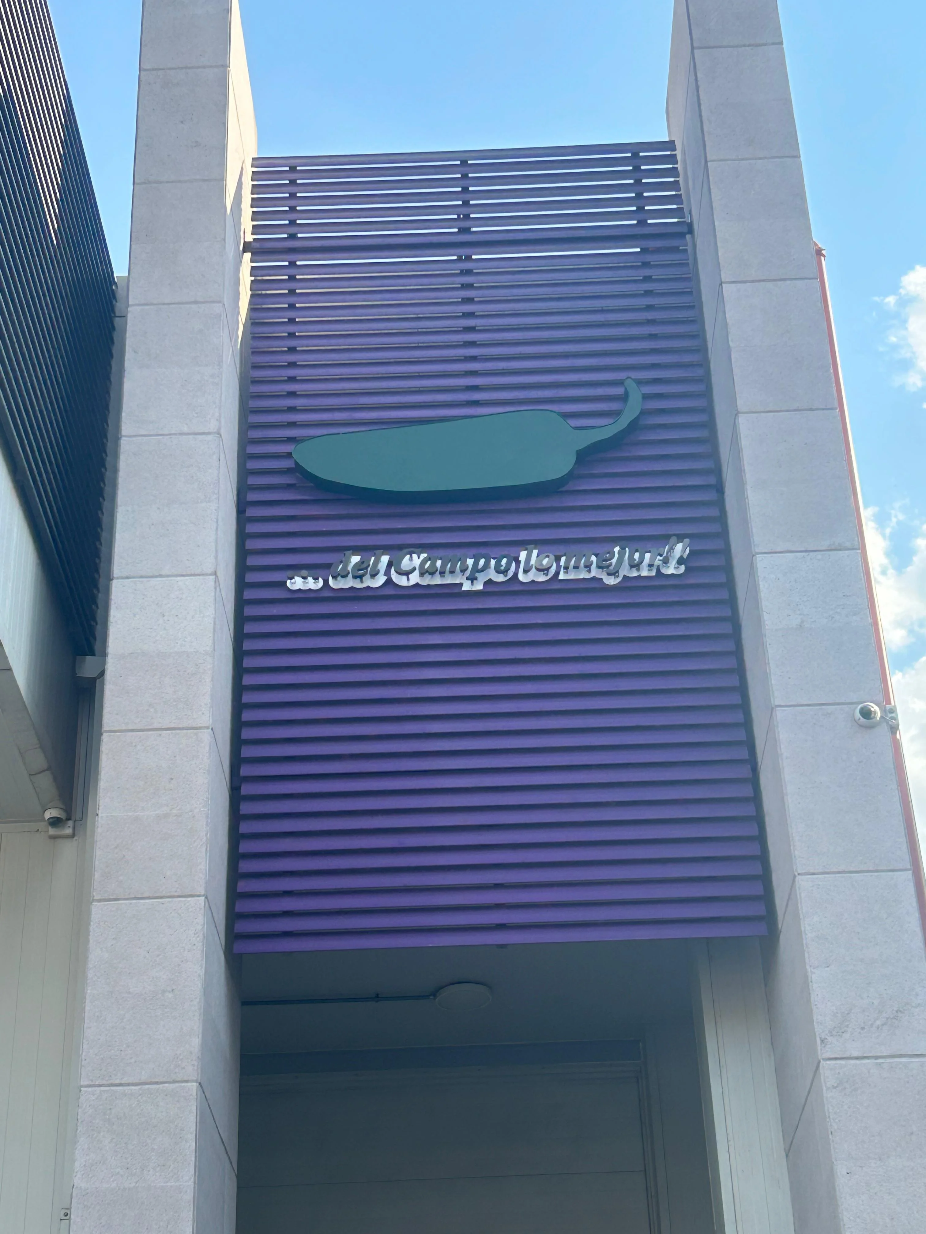
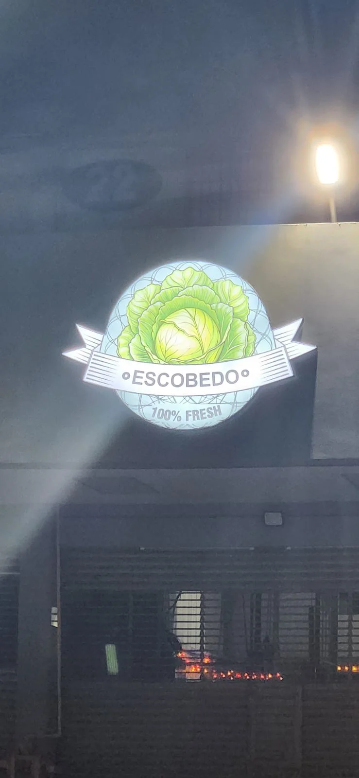
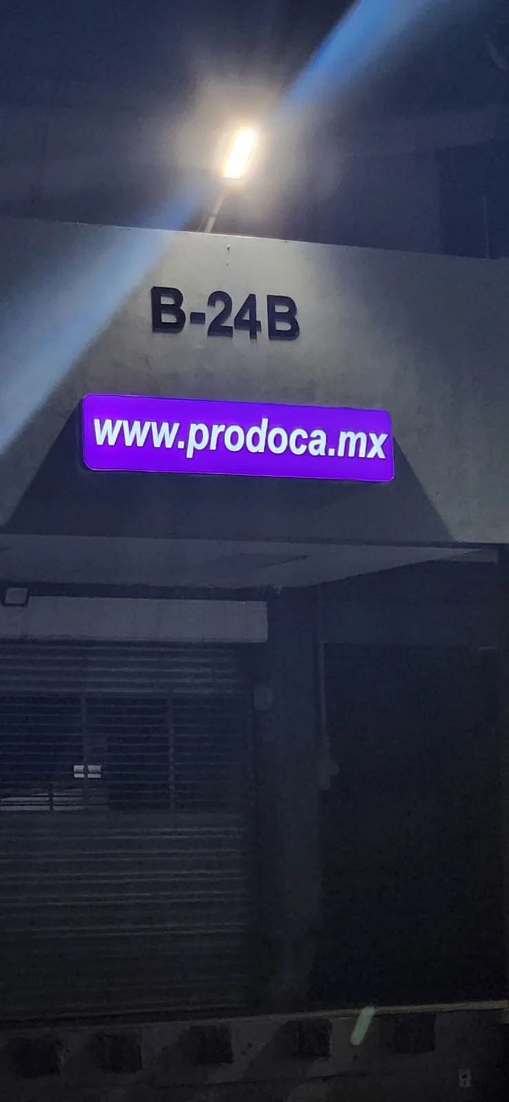
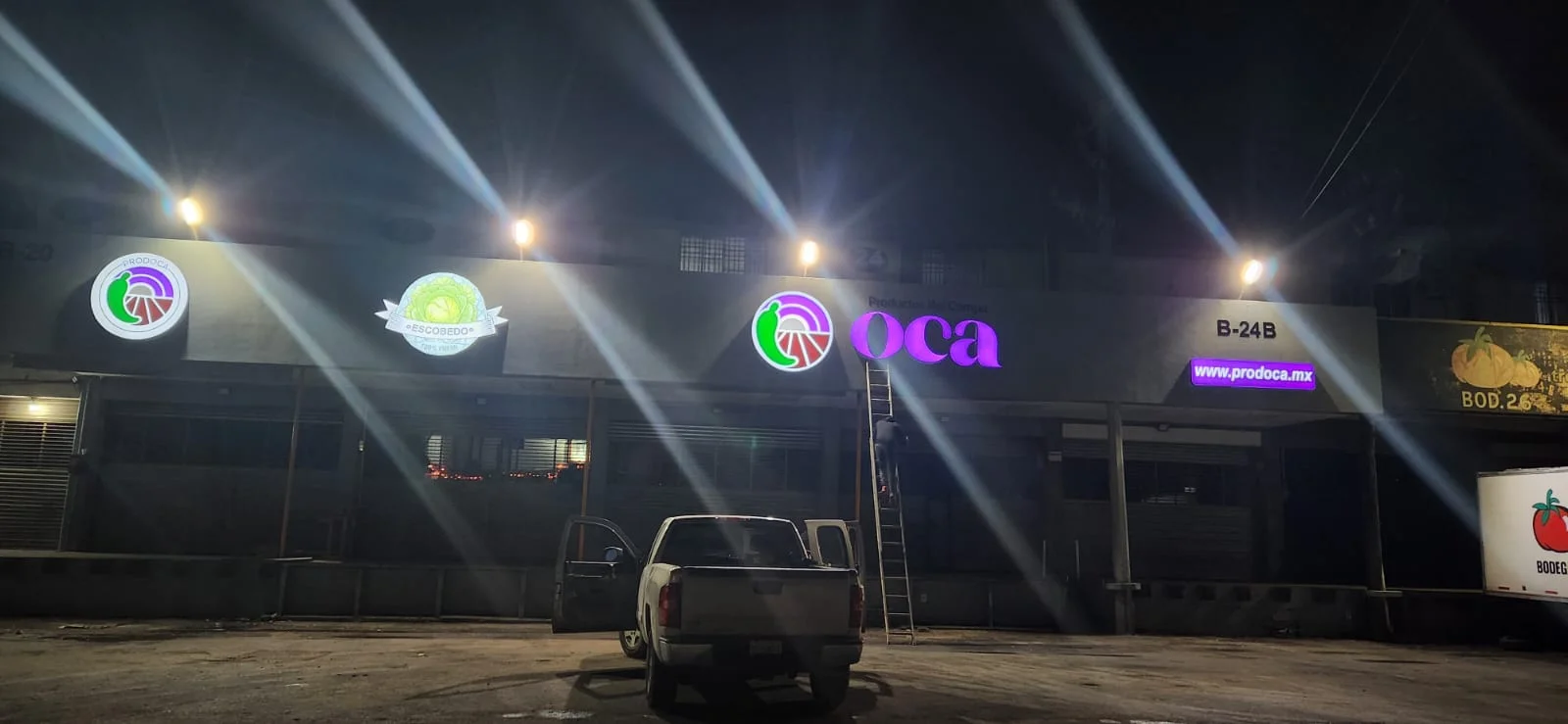
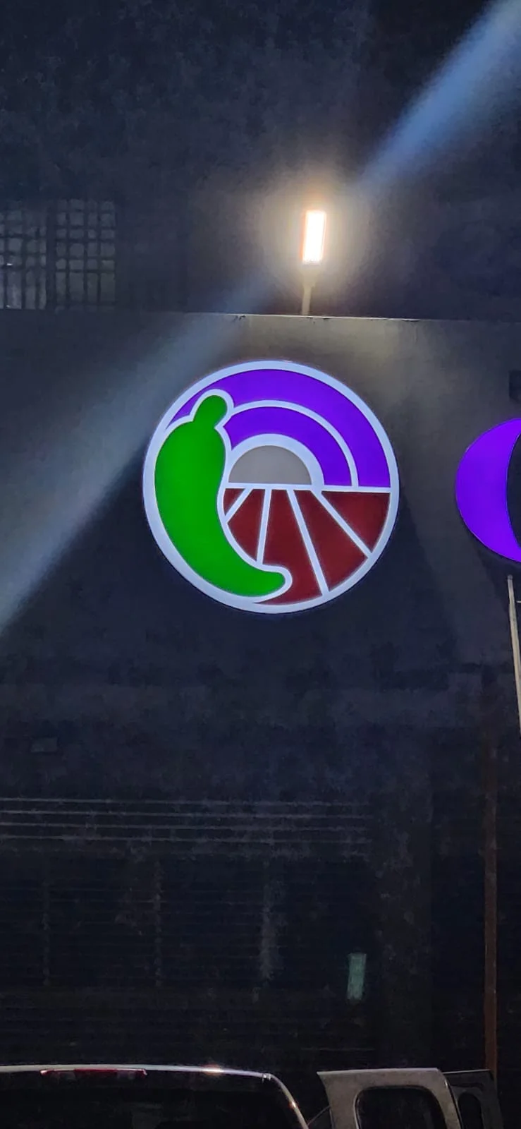
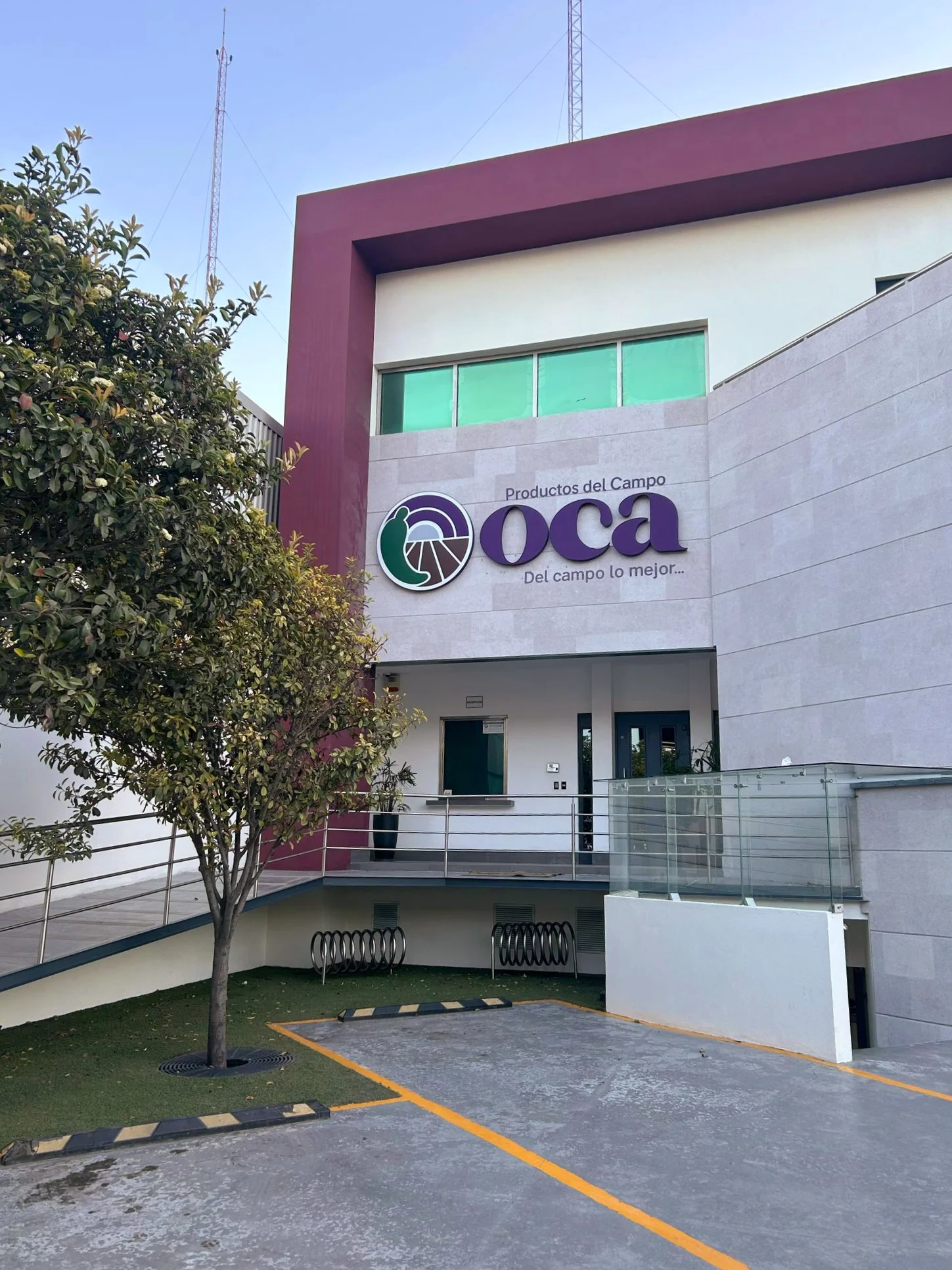
For OCA we renewed the complete visual image of its branches: we designed the new image and rolled it out location by location with illuminated 3D facade signs, so every branch is recognized the same way and is visible from the street day and night.
When a brand has several branches, the challenge is not a single sign but consistency: same proportions, same colors and the same quality of light at every site, even when the facades differ. For that we designed a family of signs that adapts to each location without losing the identity.
The result is a unified, more visible brand across all its locations, with an up-to-date image that backs the operation of every branch.